Atlas has been an ongoing project to refresh the BBC News design framework
At the beginning of 2023, I was asked to be part of the team.
We were tasked to develop a strategy and design system, focusing on unifying the visual language to create a cohesive cross-platform BBC News experience. This is being accomplished by the development of a workflow to help consistently apply the Atlas graphic language for programme identity creation and graphic component templates to be used by the editorial, engineering and product teams, therefore holistically aligning all outputs.
Part of developing this system included defining how the Chameleon values - The overall BBC advertising, marketing, bulletins style and logo refresh previously done by Wolff Olins - should be applied. This included how we use Motion to express the tone and feel of a story.
The Atlas design system was built around the Core News Globe, simplifying it into a Ring, and splitting it into Fractions.
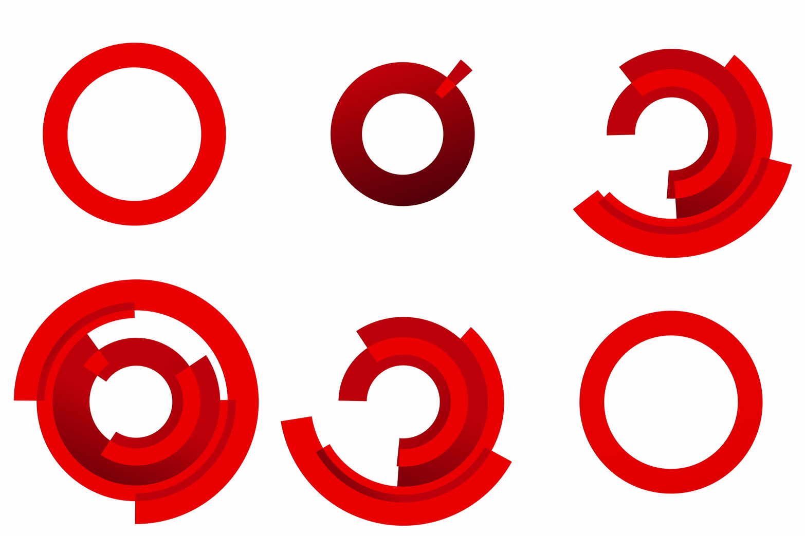
From that we have the building blocks to help create a Form - the main asset to represent a programme identity.
Taking it upon myself, I've established Motion guidelines when animating a Form while using the Chameleon bezier values:
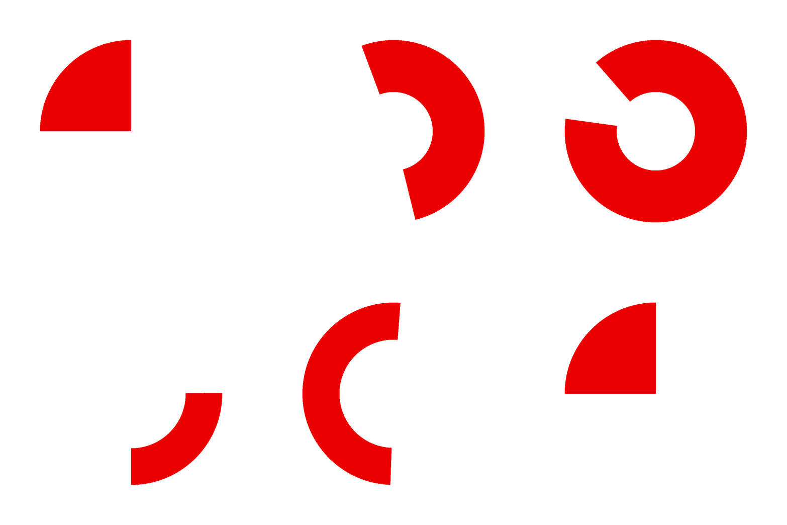
- All animations are done clockwise
- Between close fractions the shape rotates 90°
- Between opposite end fractions the shape rotates 180°
- When doing 90° the animation length is 1s
- When doing 180° the animation length is 2s
- When animating Trim-Paths, the last 'start' or 'end' key (depending which is closer to the last position key, clockwise) is set 4 frames earlier
- Rotation/Trim-Paths animate in Energise
- Stroke weights animate in Express
My role within the team was to rebrand a series of new and existing programmes, developing how we use the unique Atlas aesthetic for brands and any of their required assets.
World News America
For this programme, the brief demanded for an identity that allowed the audience's focus to be on the imagery/footage, rather than on distracting graphical elements. The title sequence was to show several different sides of America - From the deserted countryside all the way to the concrete jungles.
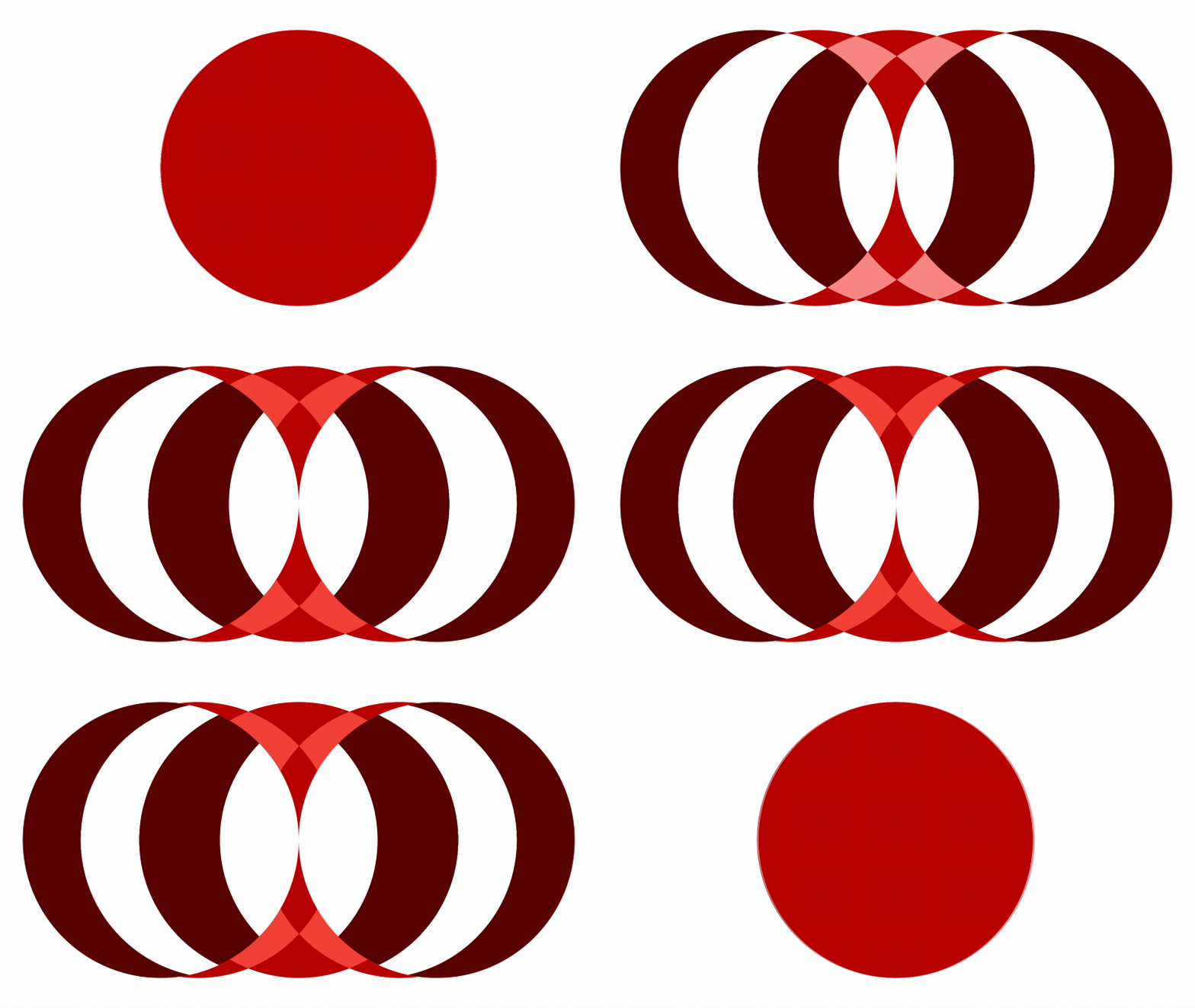
I approached the Form development in a fairly abstract way - Focusing on the tremendously high recognition factor of the USA flag, I created an optical illusion where the flag's pattern reveals itself as the form starts unfolding.
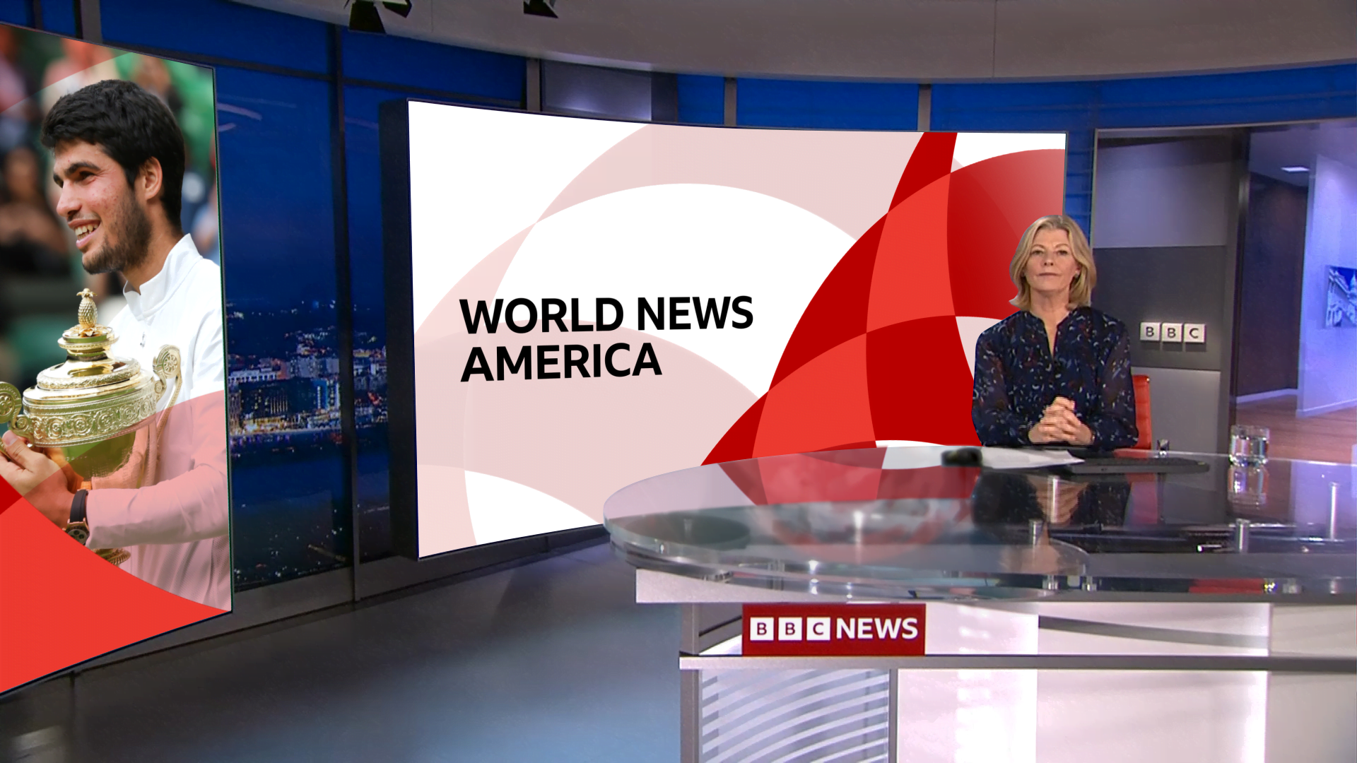
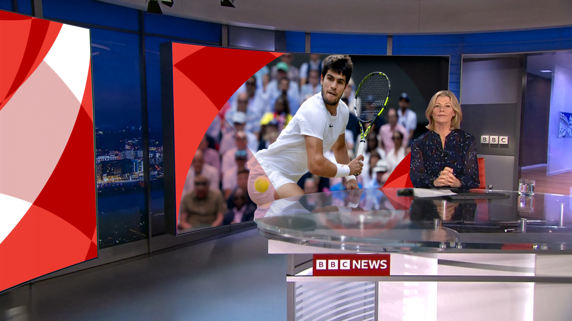
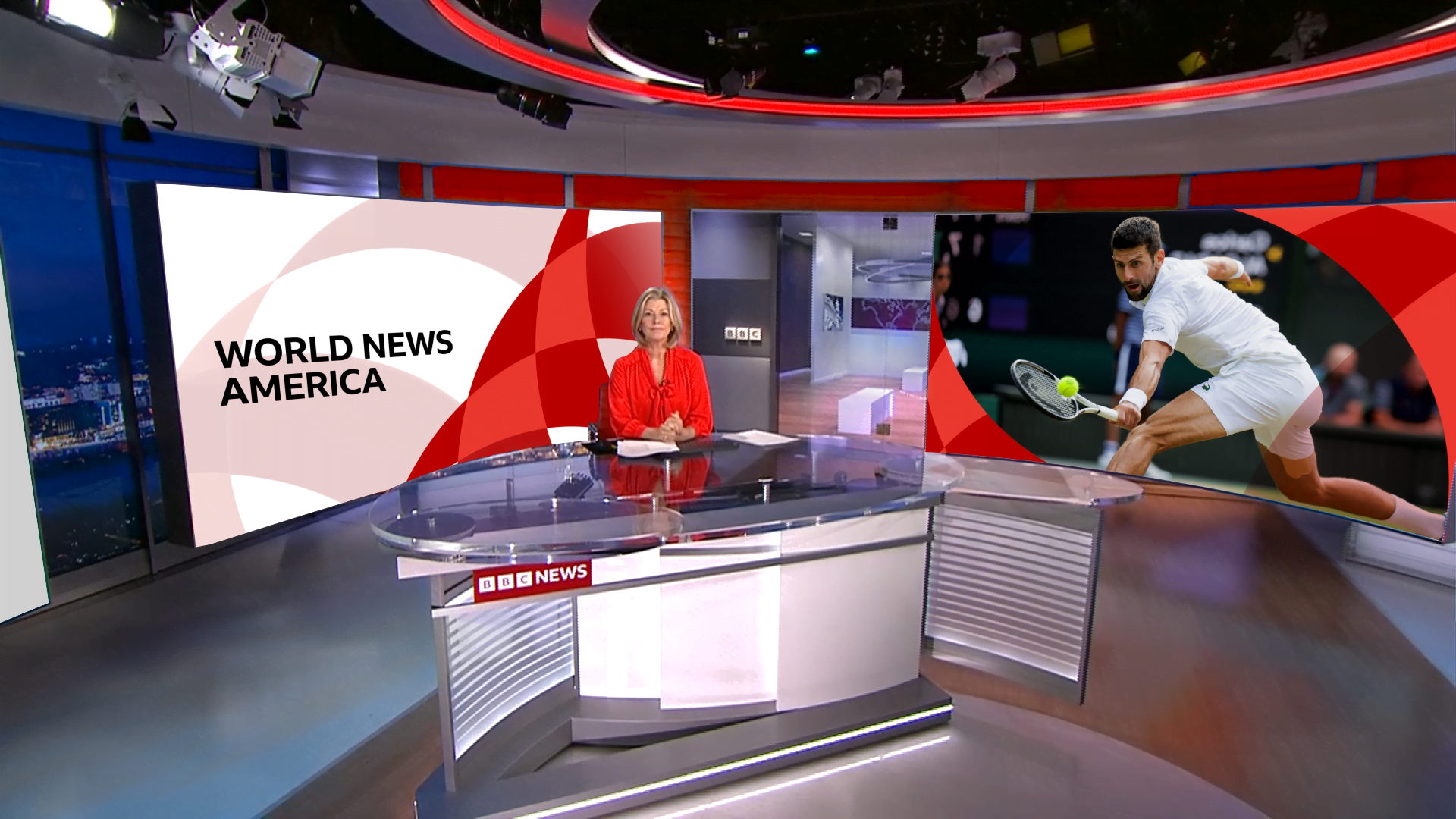
The Washington studio is composed of 2 Landscape 16x9 and 1 Portrait screens. I was asked to create a generic template that would be flexible enough to fit imagery/footage on any one of or multiple screens at any time.
Some in-situ mockups of the templates:
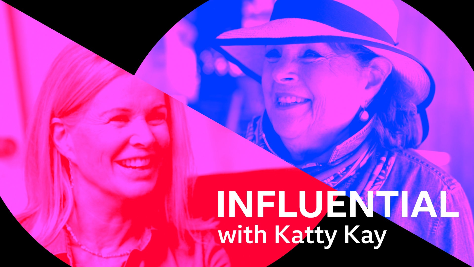
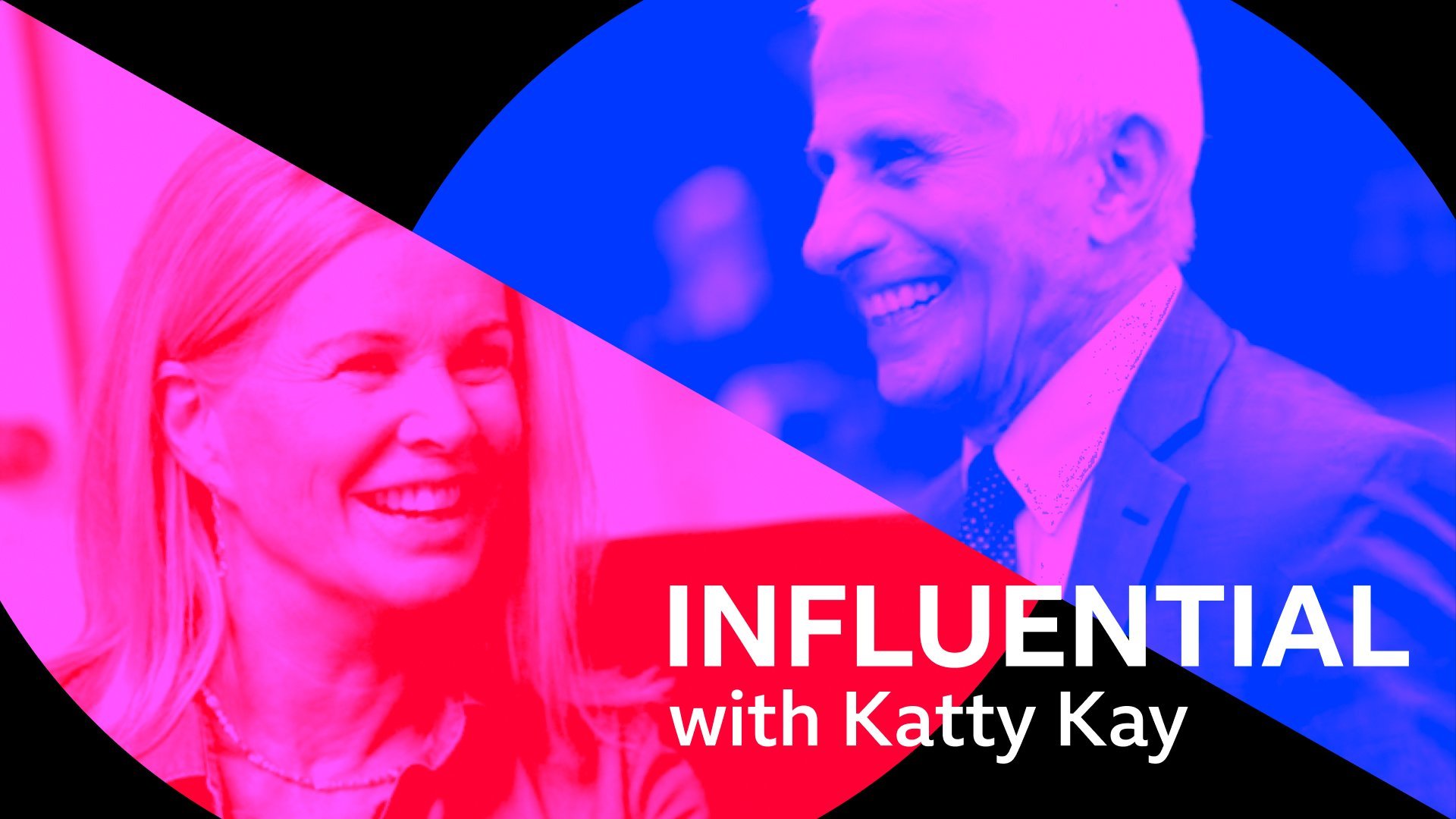
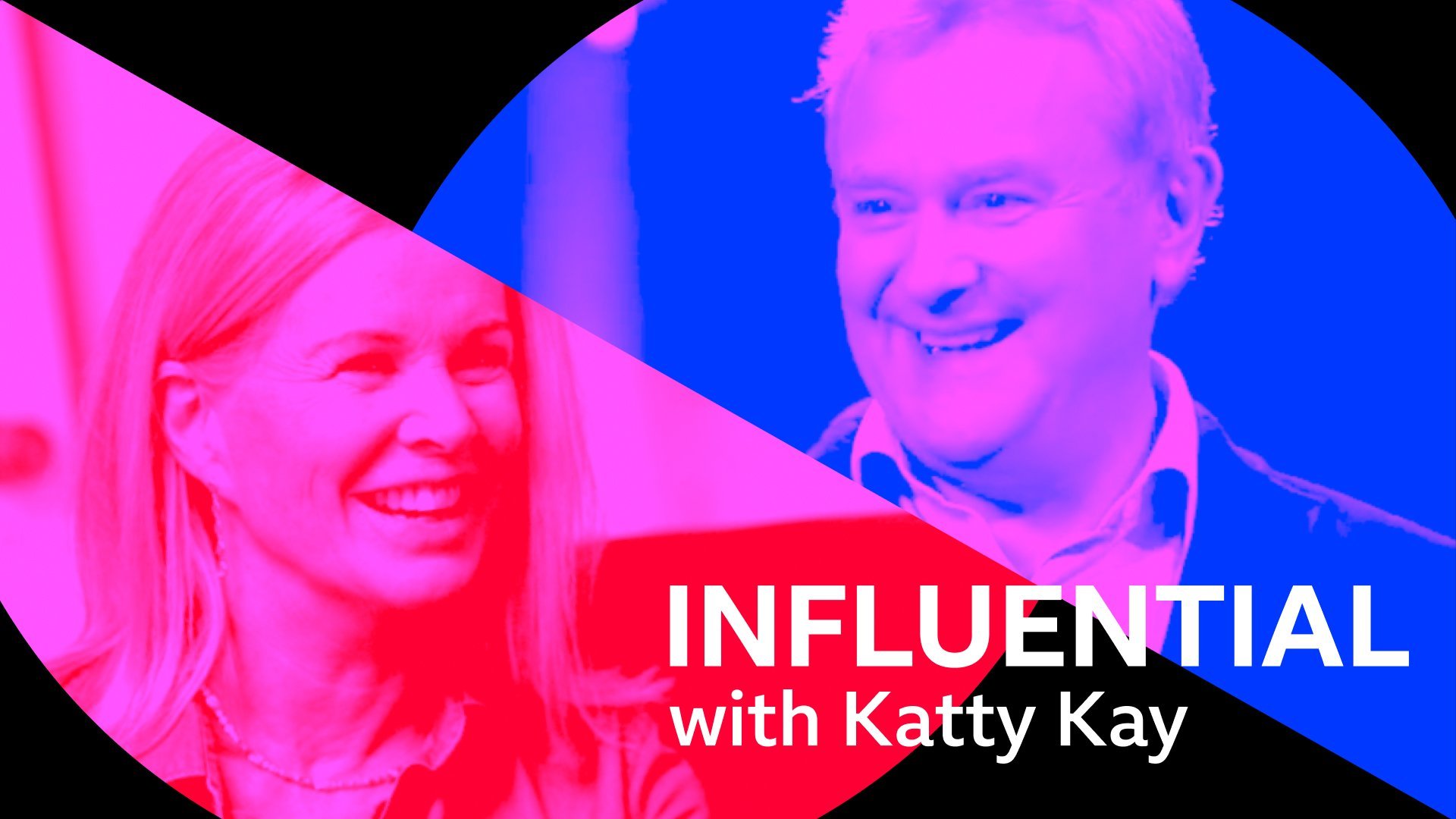
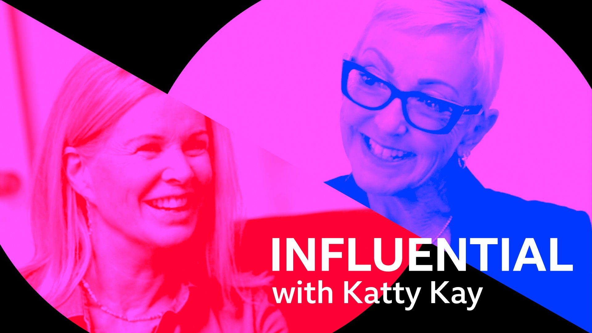
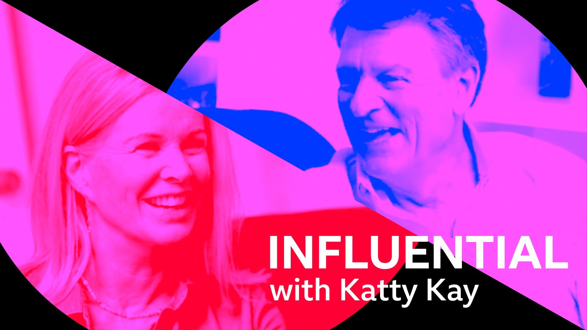
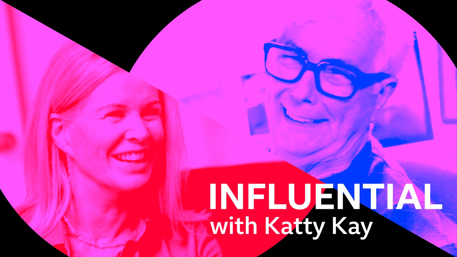
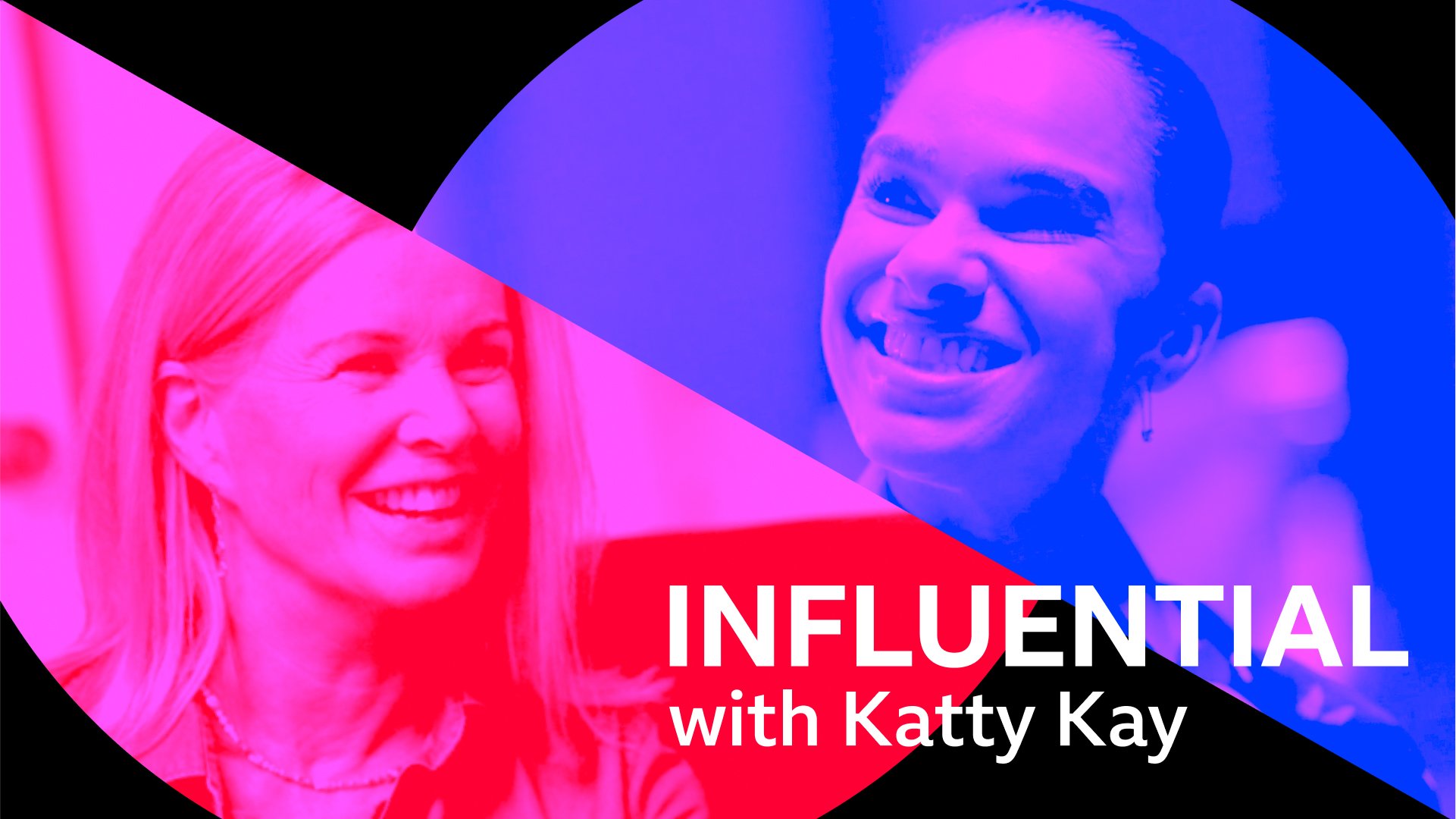
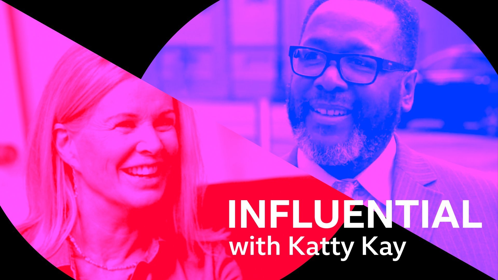
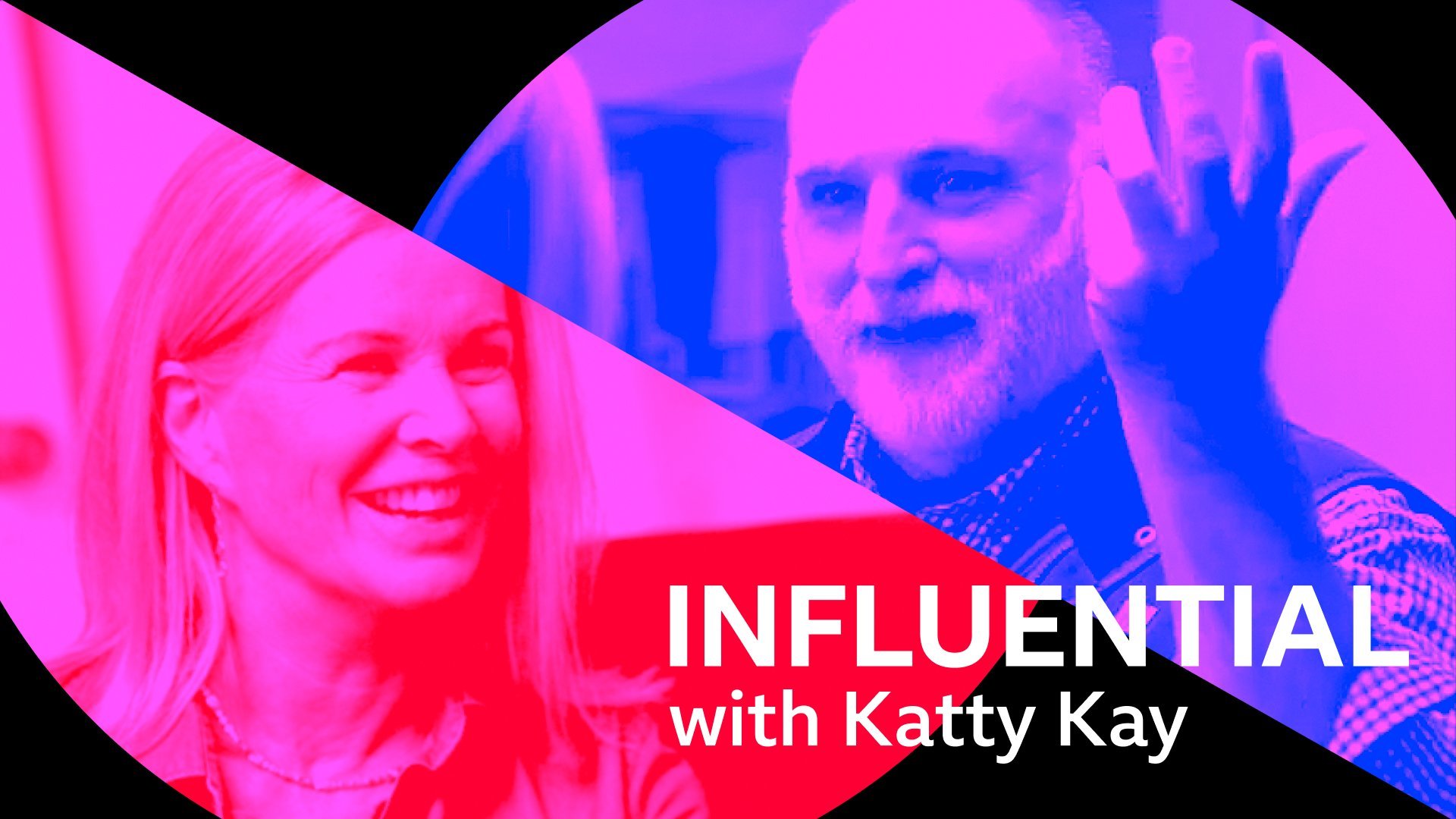
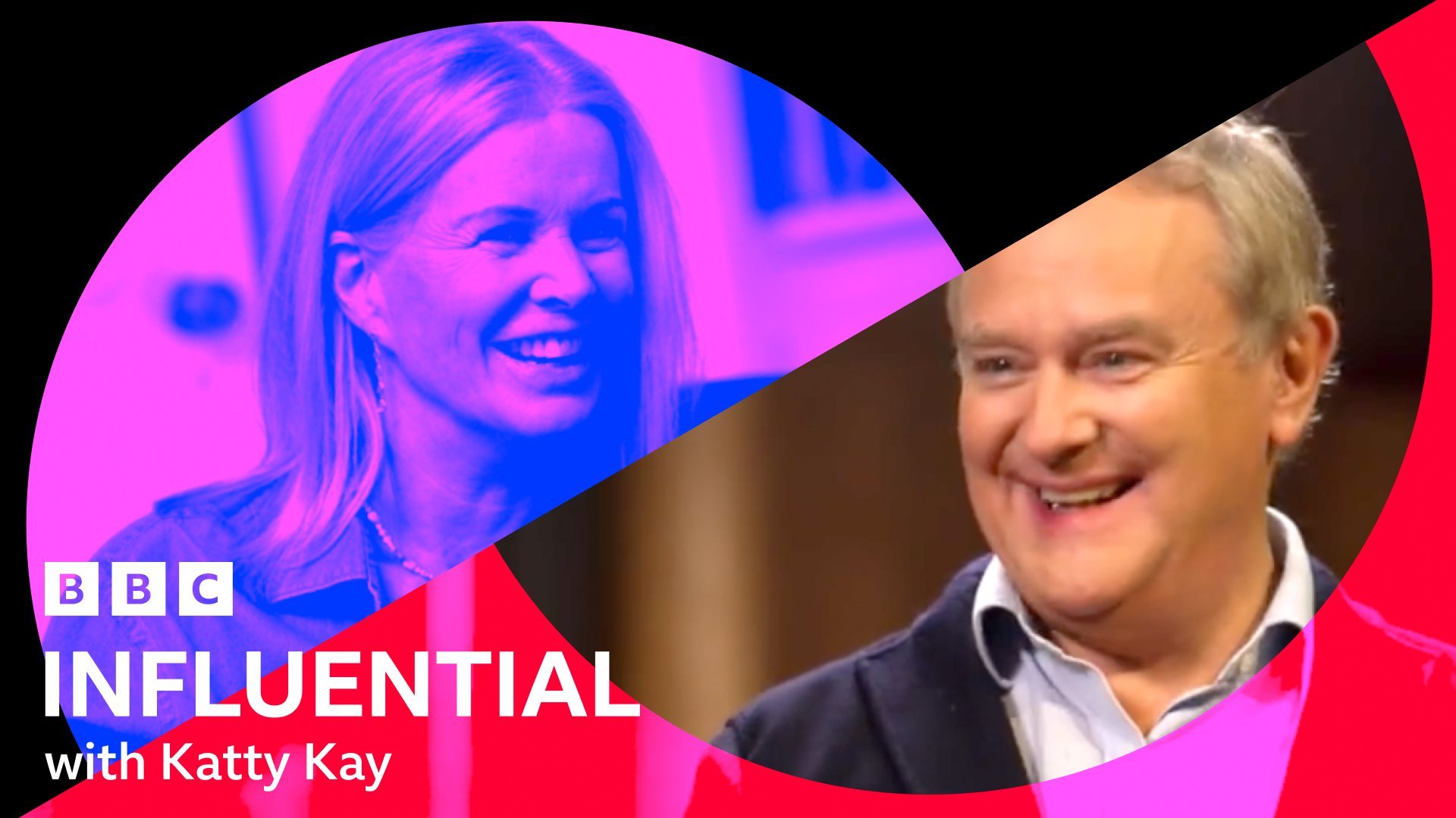
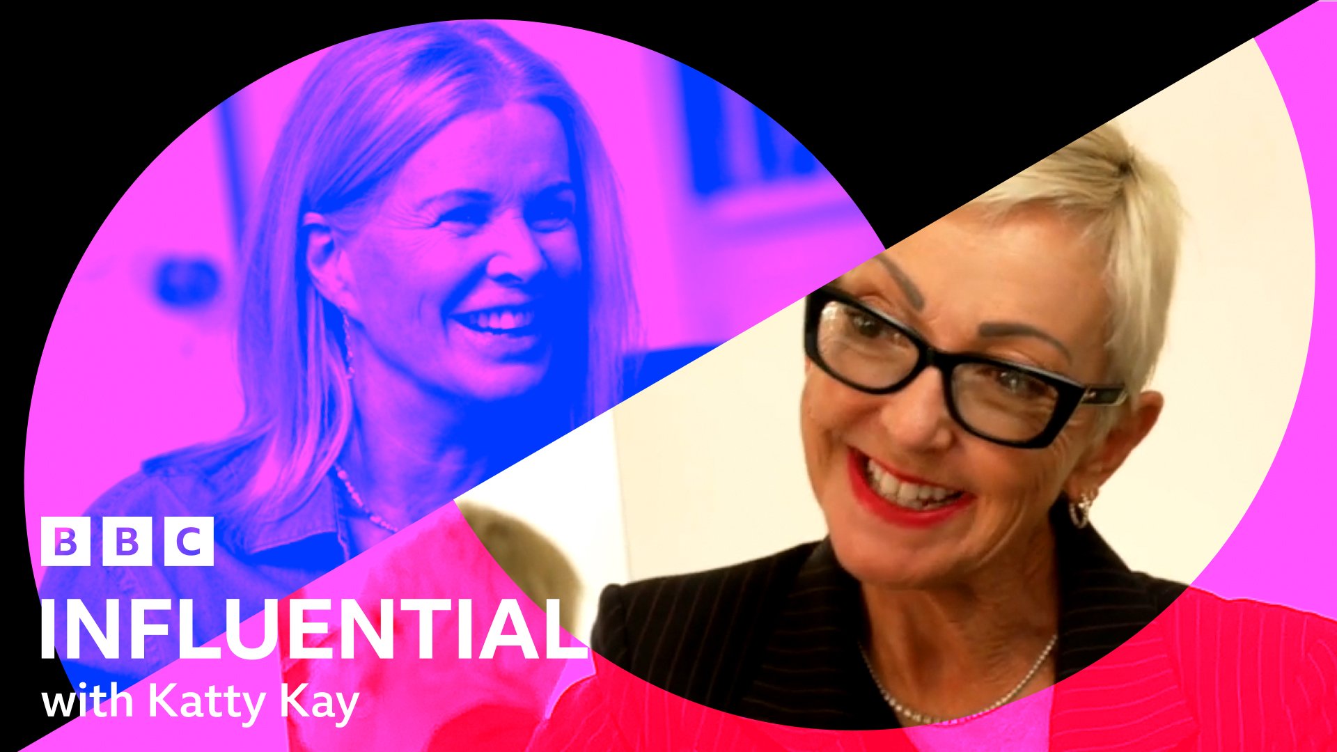
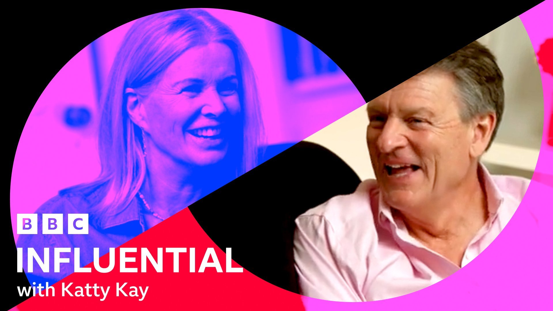
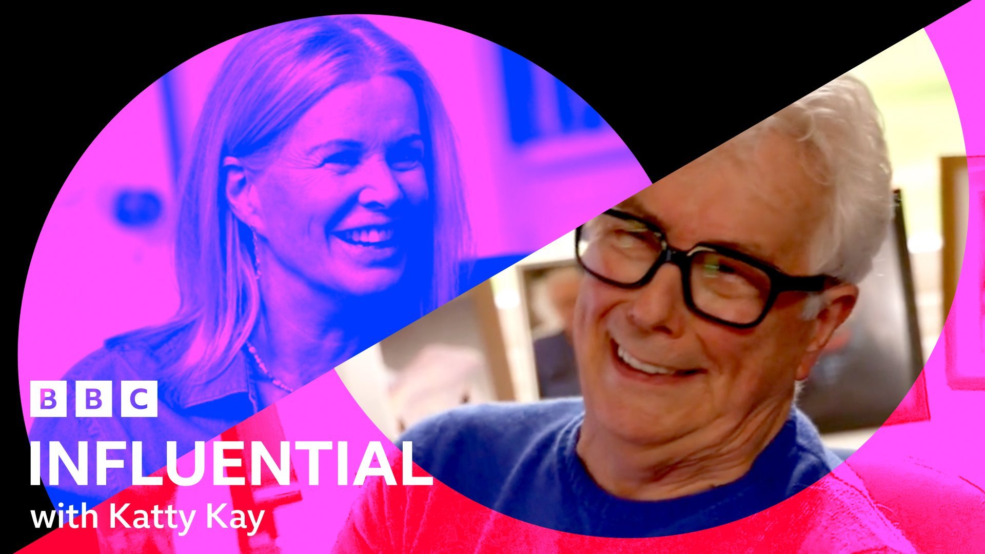
Influential with Katty Kay
For Influential, the approach had to be different from the get go.
The Atlas system works by dividing the programmes into two categories: Near and Other. The content of Near programmes are often closer to the news bulletins, usually having a serious tone, therefore visually we stick with the news colour palette of BBC reds, white and black (as seen in World News America), meanwhile Other is where we fit the shows that feel more separate from the depth/gravity of a typical news programme, so visually we have more freedom to get creative.
Influential is a show where Katty Kay interviews several interesting people from different backgrounds, in a sometimes light-hearted, other times weighty manner. The range of the programme and its ability to evoke all kinds of emotion, allowed the show to fit into the Other category.
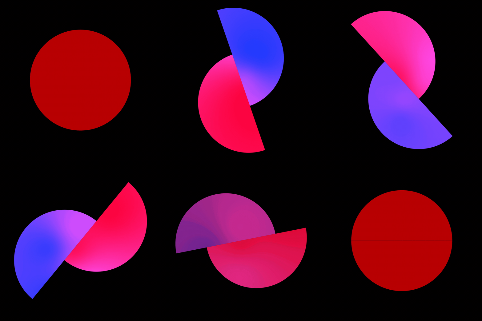
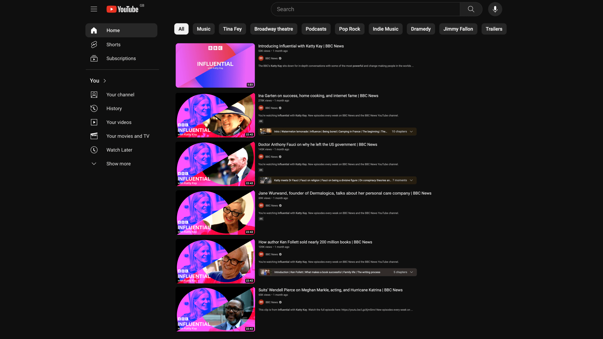
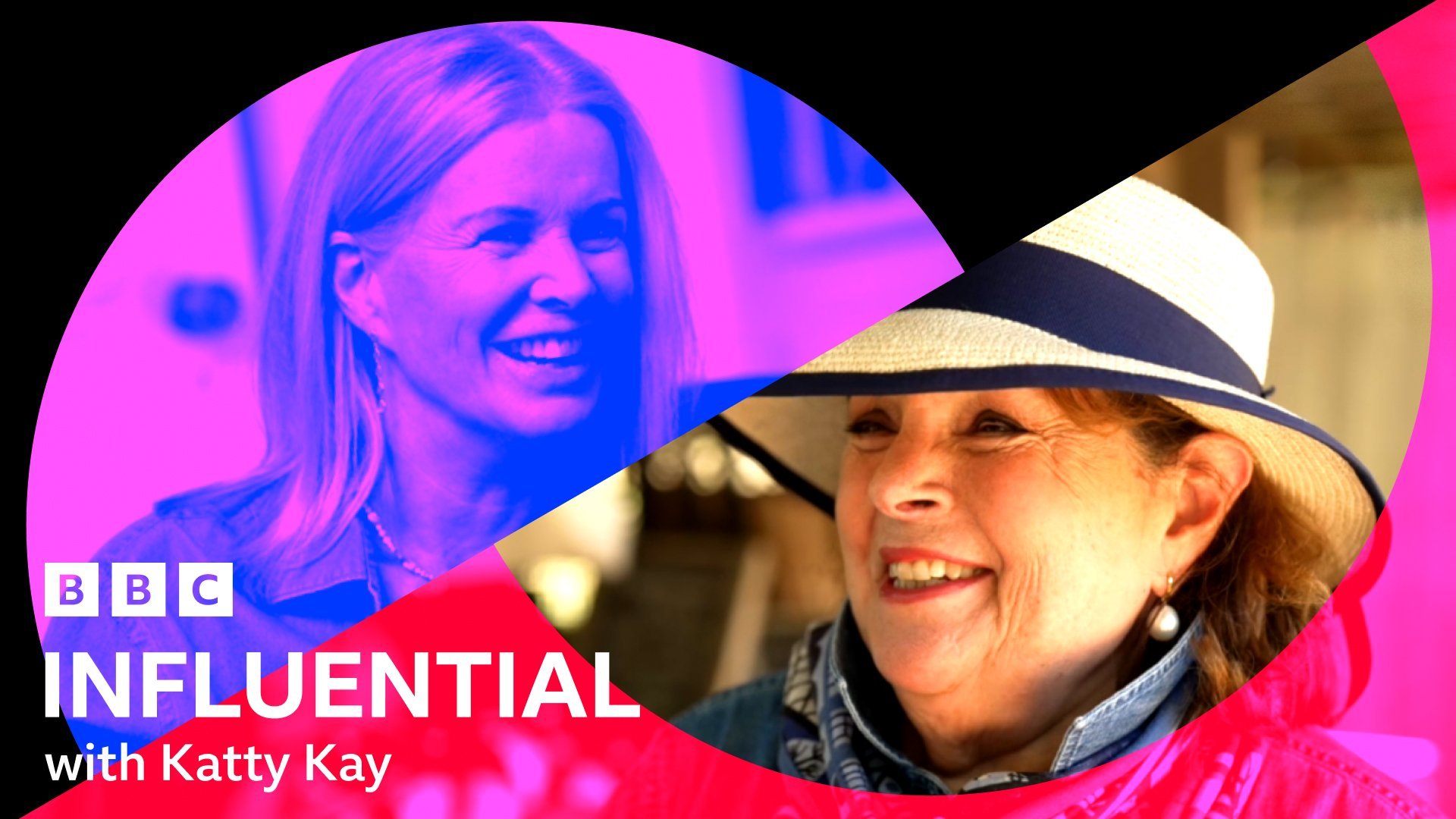
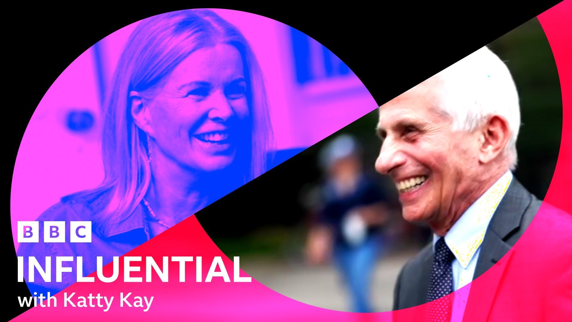
For the brand, the brief asked for it to be focused on 'a conversation' and to feel intimate, elegant and fresh. I designed the Form in a simple and clean manner, focusing on the two sides of a discussion. The concept of the two sides also inspired the colour palette - Using duotones when possible to give the audience a sense of the dual voice and their exchange, being represented on all aspects of the brand.
For this 9 episode series, part of the brief consisted in cross-platform episodic thumbnails - that request included both Youtube and iPlayer thumbnail templates that seamlessly fit with the rest of the brand.
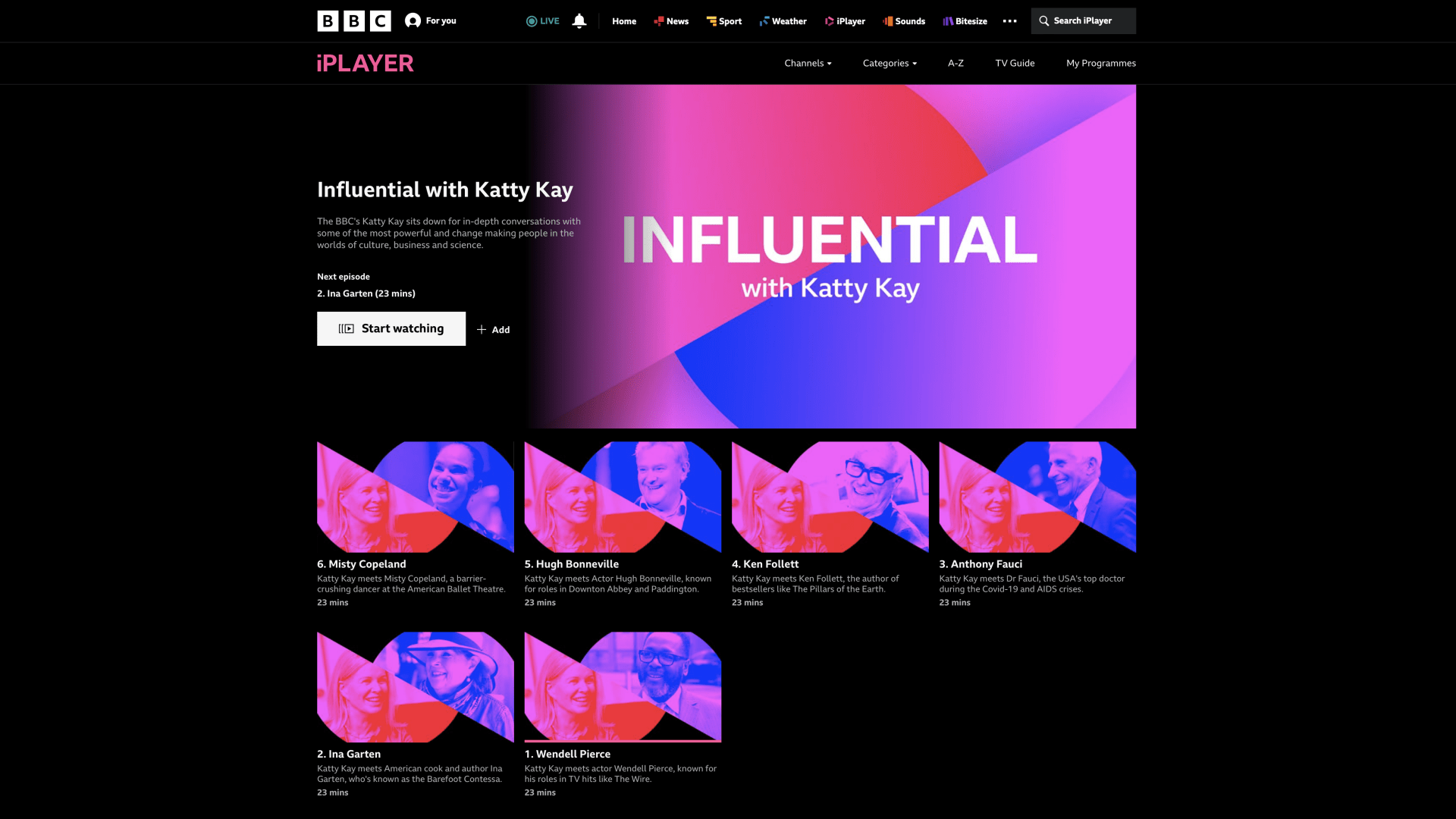
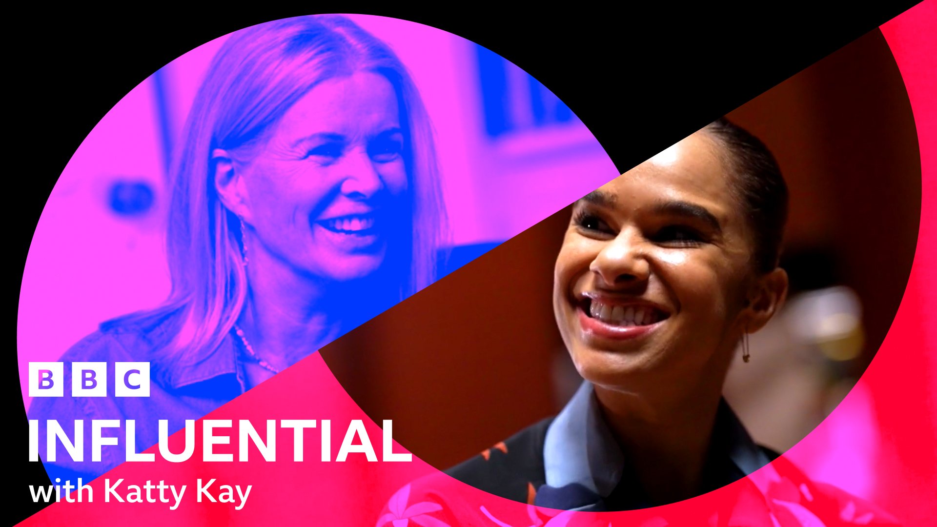
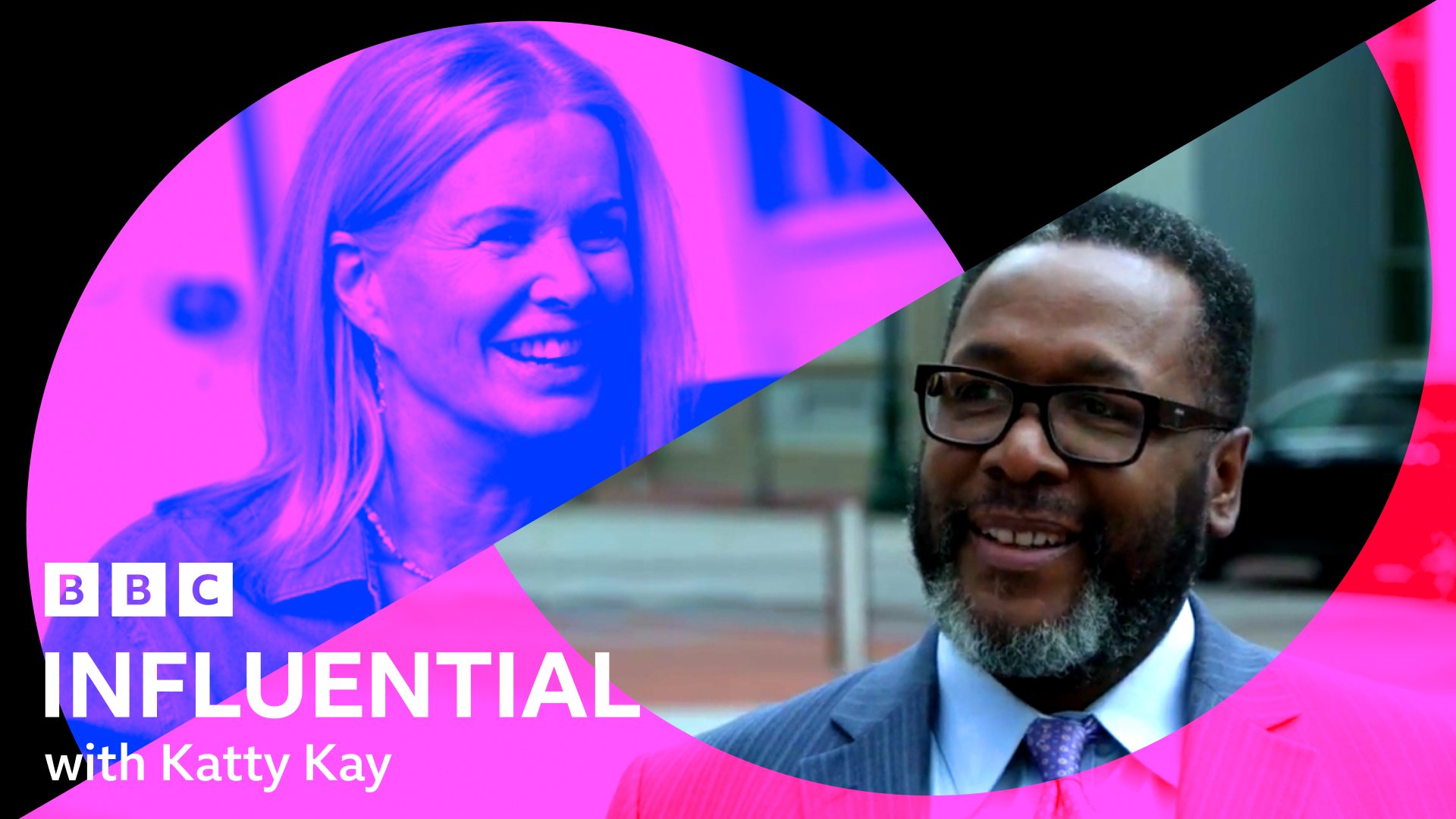
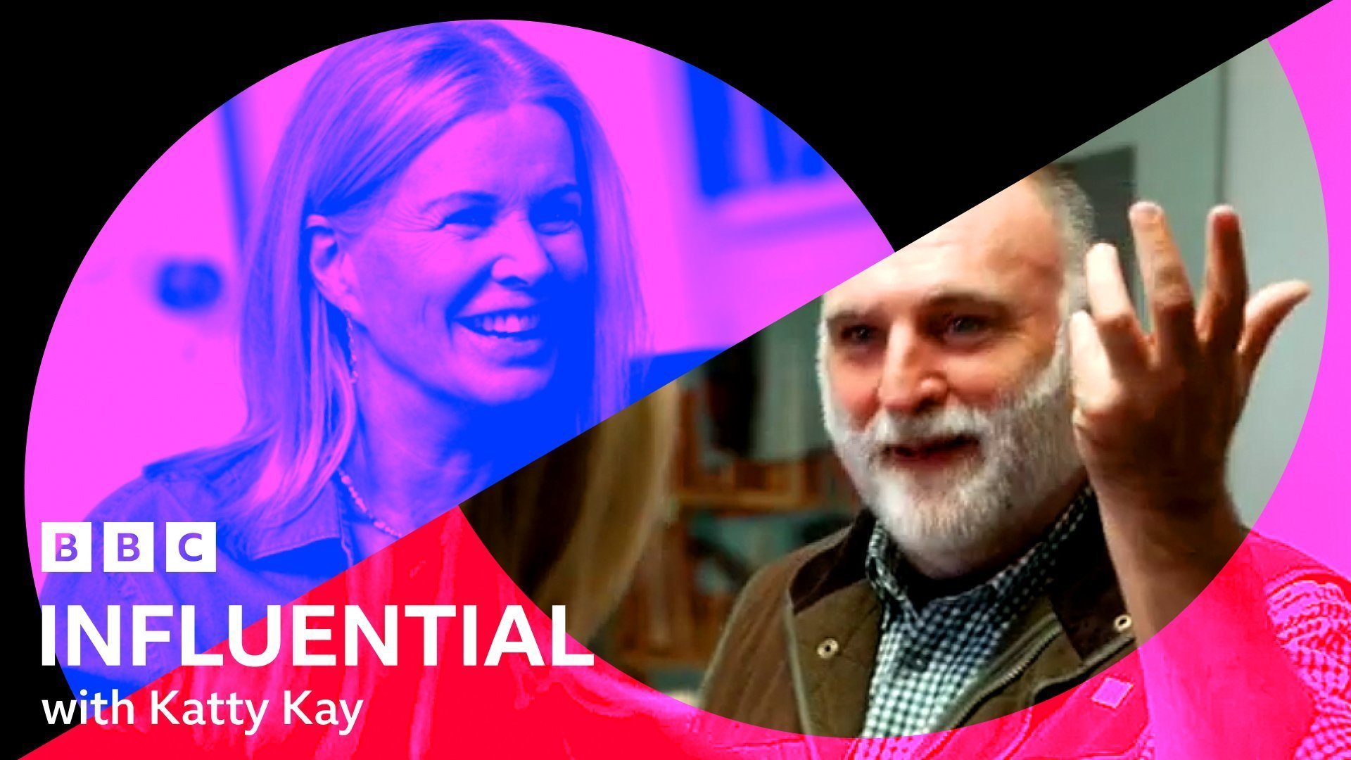
This project is ongoing, however the first few programmes that fit into the Atlas framework are already live and helping to reduce the previous visual disconnection between shows.